RIPIO APP —
GROWTH THROUGH CLARITY
Losing ground to the competition
When I joined as UX Lead, Ripio was a basic crypto wallet — buy/sell, a card, and a non-custodial Web3 wallet. Solid foundation, but the experience wasn't keeping up with the competition. App Store ratings were at 3.2, NPS was falling, and challengers like Lemon were gaining users fast.
Over the next two years we expanded the product significantly: QR payments, utility bill payments, collateralized loans, gift cards, PIX, a full home redesign, and more. The challenge wasn't just shipping features — it was building the design maturity to ship them well. No design system, no UX QA, decisions made without data. Anything could go out "just like that."
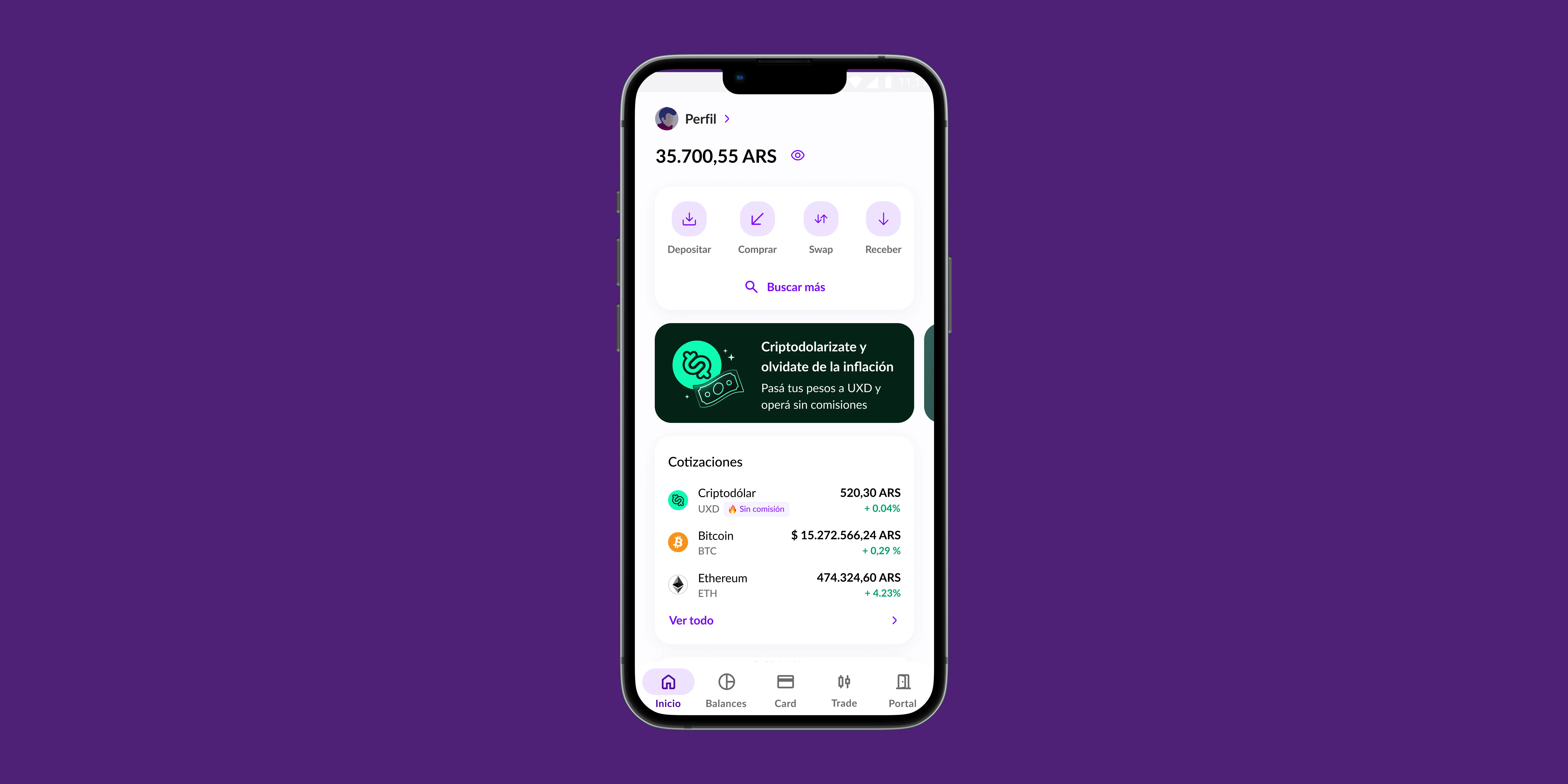
Home redesign
 Home — Before · 2023
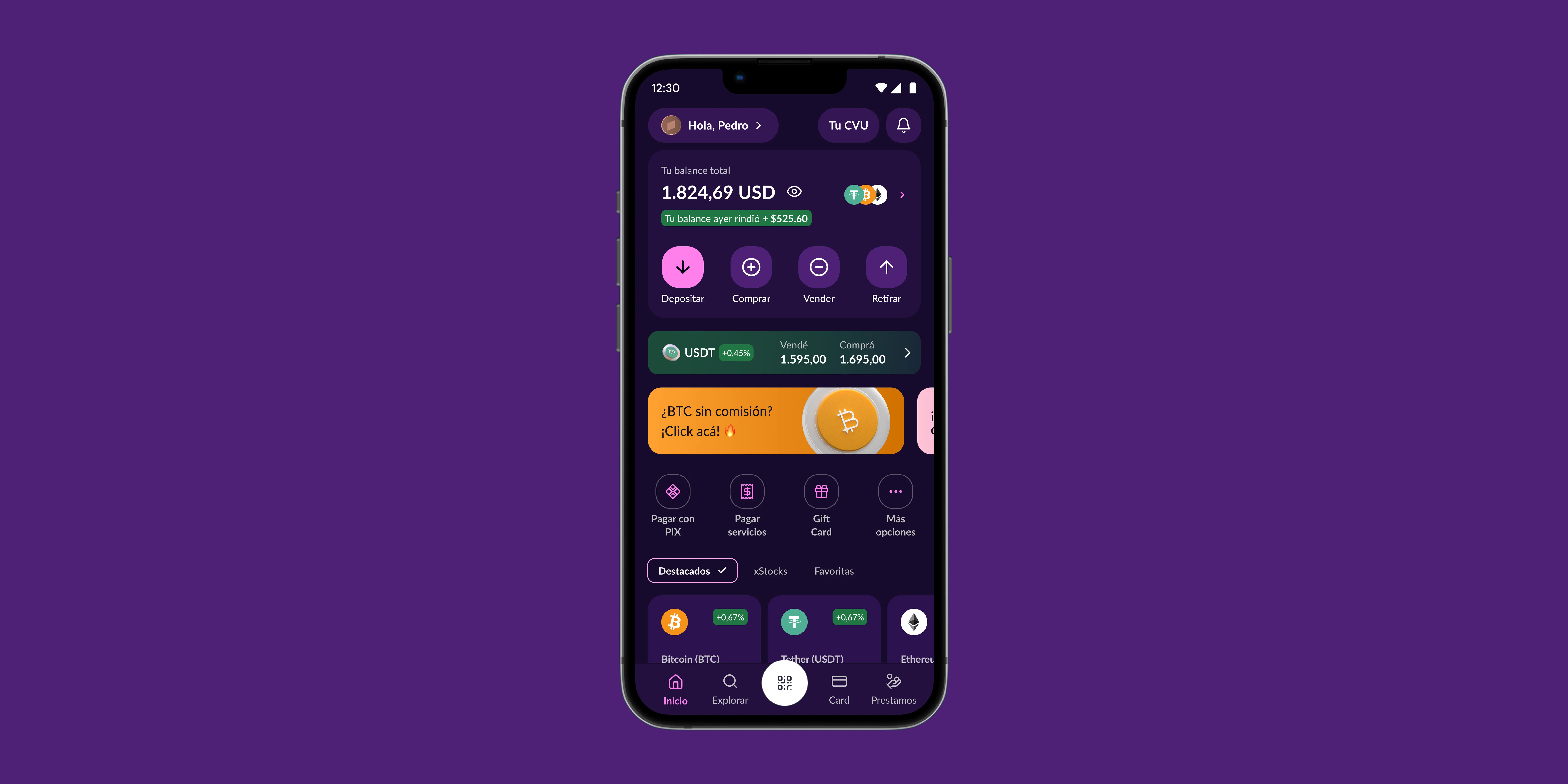 Home — After · 2025
Changing how decisions were made
The first shift wasn't a redesign — it was a process change. We introduced structured research into the cycle: Maze tests with real users, prototype testing before development, Amplitude analysis to understand drop-offs, and regular NPS + survey rounds. Design started having a seat at the table when prioritizing, not just at execution.
We also established a UX QA phase. Nothing shipped without design validation. That alone reduced the amount of "this got lost in translation" moments between Figma and production significantly.
What we redesigned
A full app overhaul — from the home to the most critical user flows. Some highlights:
Redesigned information architecture. Quick access to the most-used flows and a clear portfolio overview for the user.
Simplified deposit and withdrawal flows. Reduced friction and steps needed to complete each operation.
Redesigned the internal exchange. Cleaner, faster, with better status feedback at every step.
New product designed from scratch. Access to digital dollars with UX tailored for non-crypto-native users.
Redesigned asset visualization. More contextual information, improved charts and visual hierarchy.
New tokenized stock investment module. Designed the full flow: discovery, purchase, and portfolio tracking.
Key flows
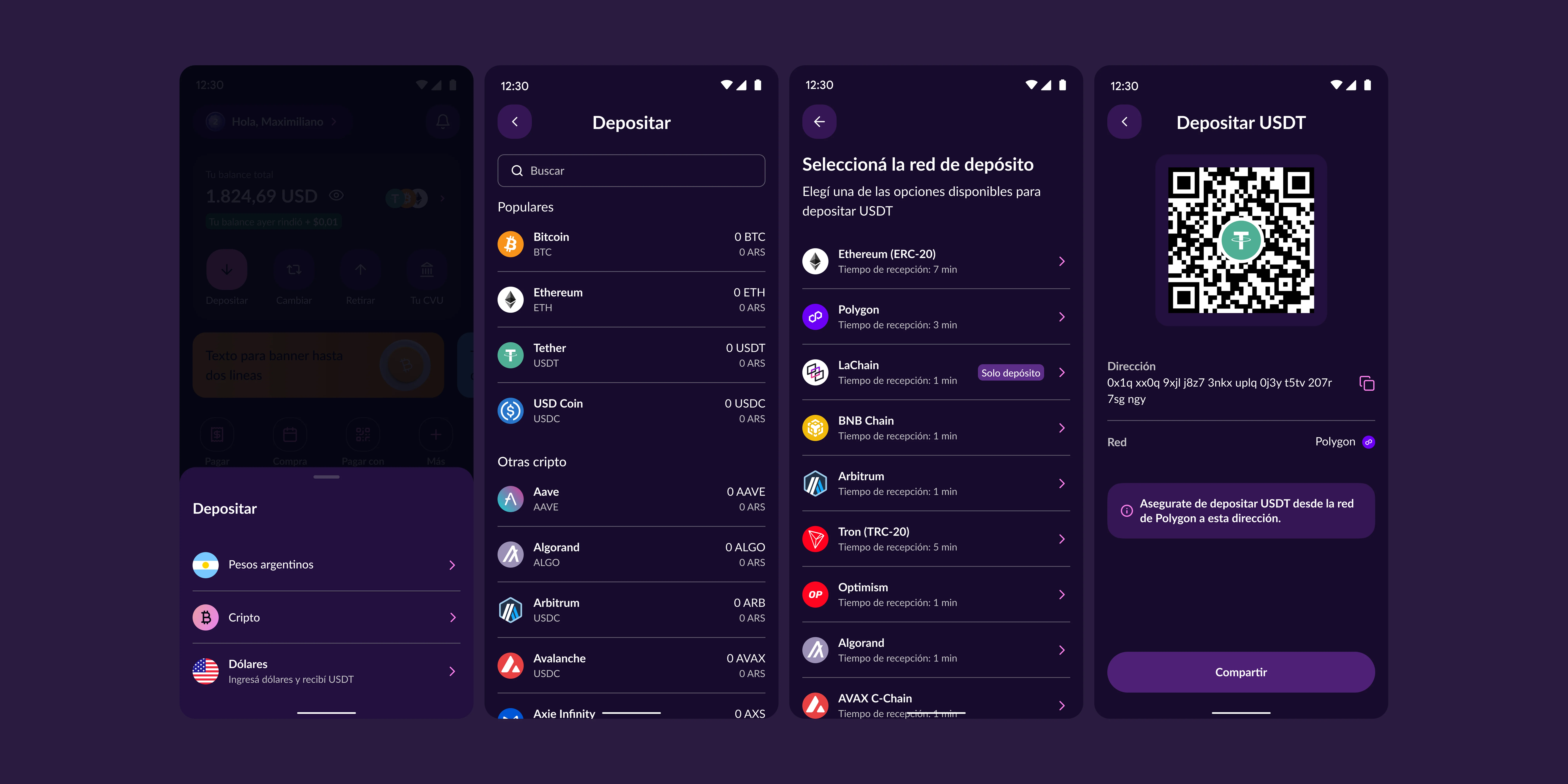 Cash In
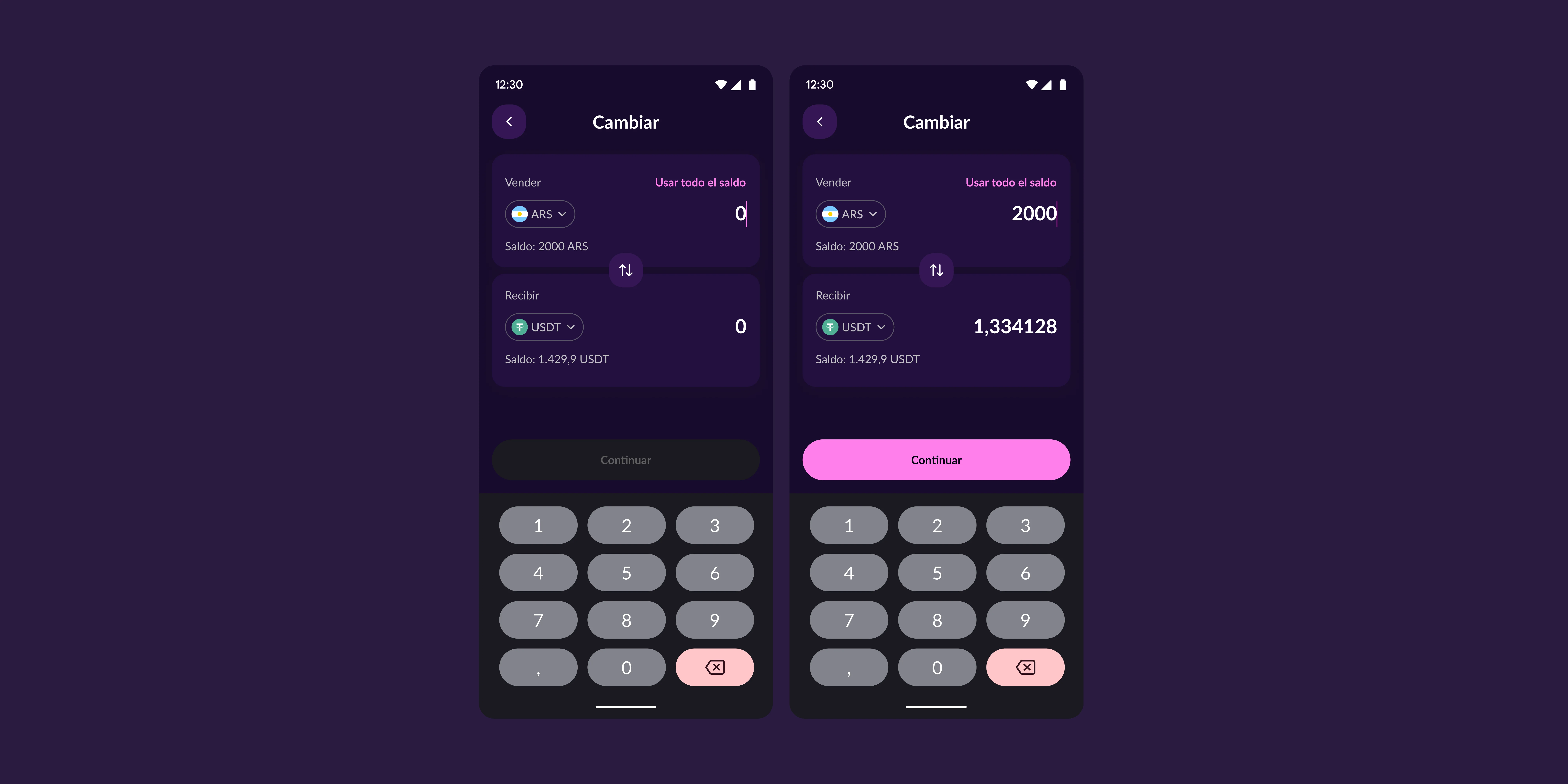 Swap
Swap
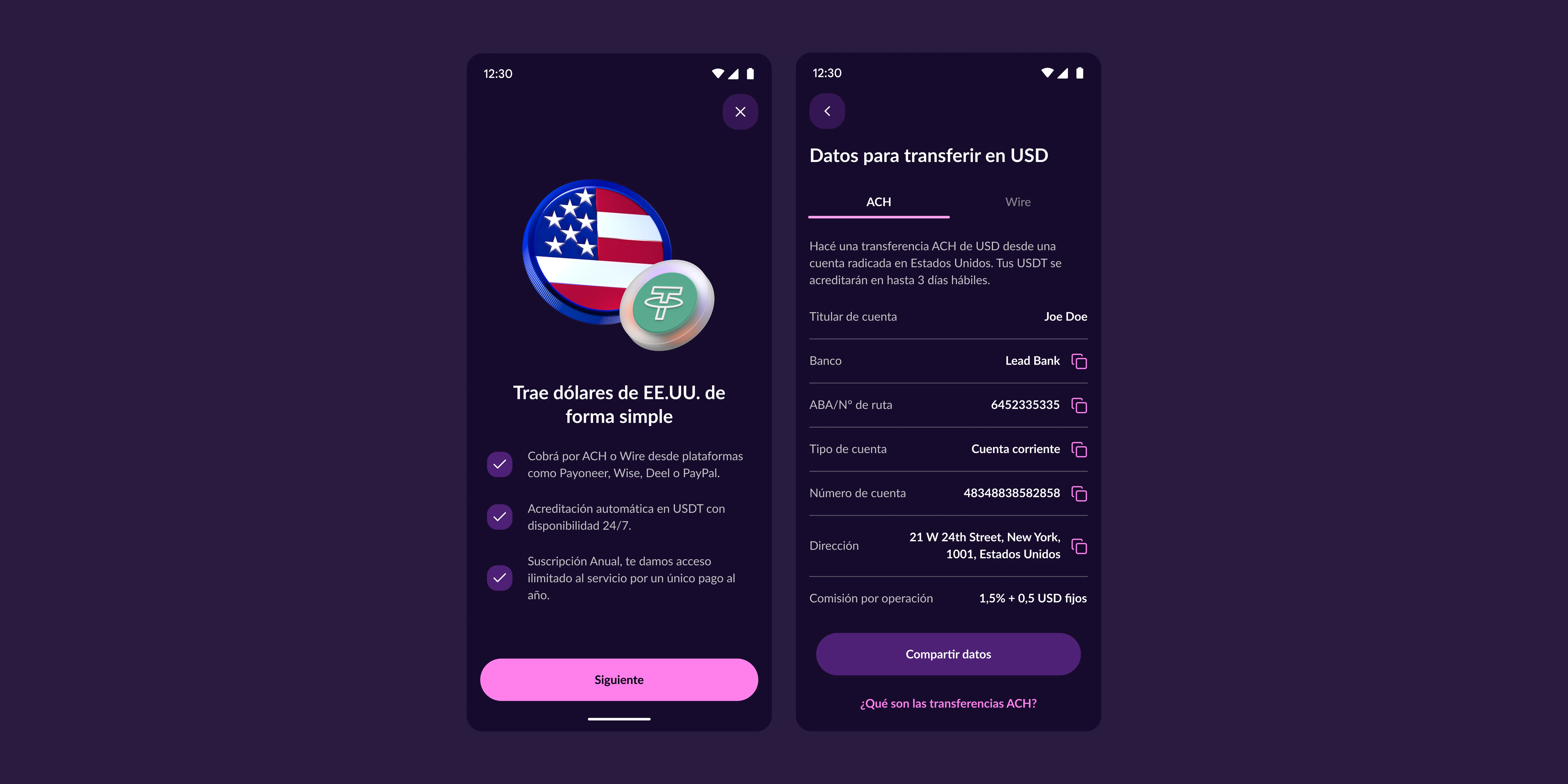 Dólares
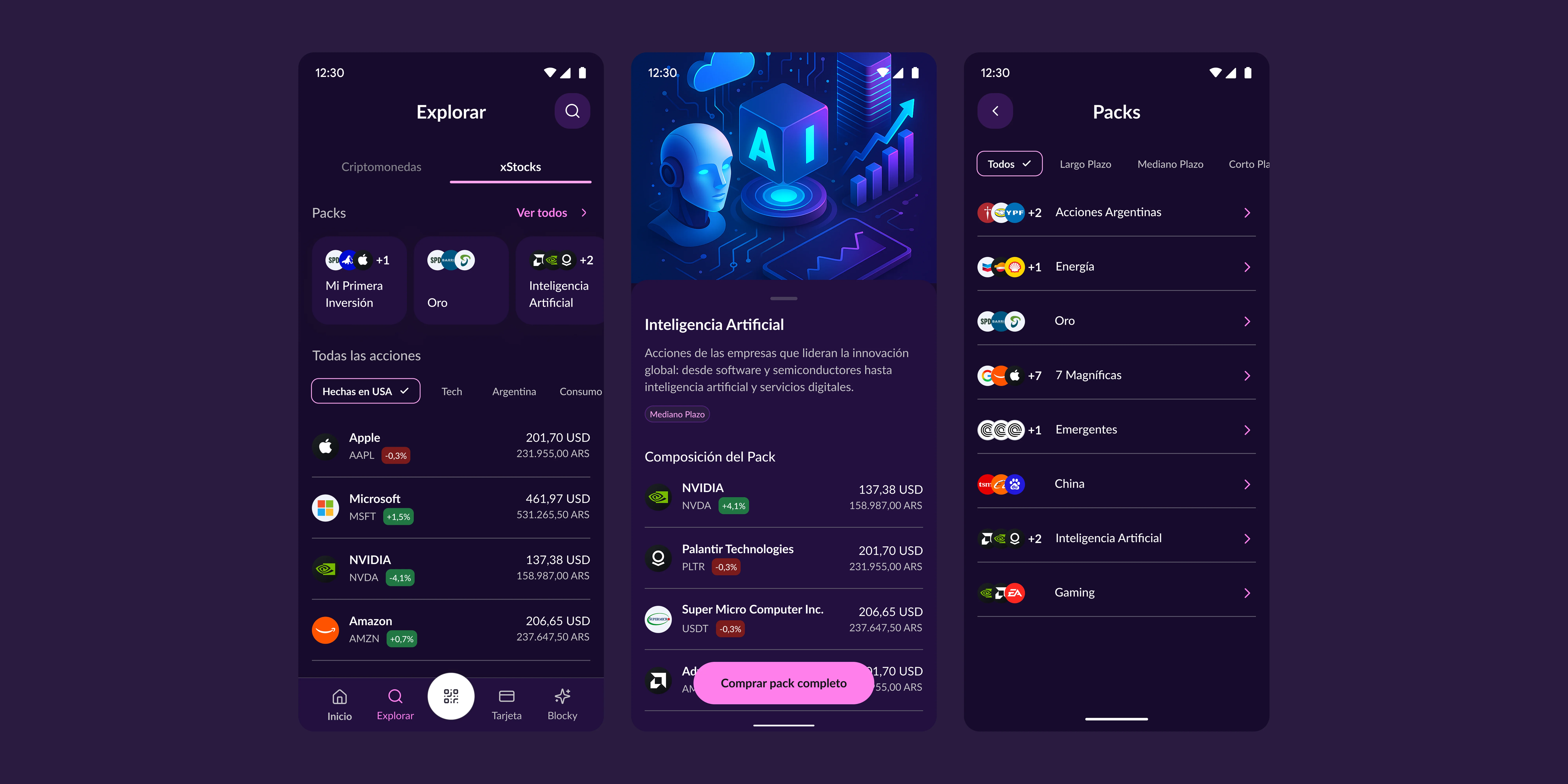 xStock — Discovery & Purchase
Numbers
Learnings
The biggest change wasn't visual — it was cultural. Moving from gut-feel decisions to real user data changed how the entire team prioritized. Having a design-led QA process was what allowed quality to scale without relying on individual reviews. And building a design system in parallel was what made all of that sustainable.